You browse thousands of websites everyday (not sure about you, but I do). What if while browsing a website, the menus aren’t clickable or you aren’t able to navigate to another page? It’s really frustrating, right?
Would you like this to happen with your website? Of course no one would. So, what can be done? You should have a smooth website navigation enabled on your website.
Website navigation is considered to be worked on after pages and content by many of you. When recently a survey was done, it was found that only 50% of internet users were able to guess where relevant content would be, based on standard website navigation structure.
Suppose half of your visitors aren’t able to find the page they are looking for then it’s a big UX problem.
There will be increase in your bounce rates, decrease in visitors’ time on website and less conversions.
If you are the owner of an ecommerce store, bad navigation can also badly affect your bottom line and revenue.
In this post, I will cover right from A to Z about website navigation. You will learn the best practices, types of navigation and in short the ways to create a perfect navigation for your website.
Let’s start!
Website Navigation Explained in Short
Basically, website navigation is the process of navigating pages, apps, and websites on the internet. The technology used for it is called hypertext or hypermedia.
Hypertext or media are text-based web pages that utilize hyperlinks to connect them to other pages on the internet.
A link that takes your web browser to a URL is called as a hyperlink.
The URL helps you to know the file that should be accessed by the browser from the server and downloads as well as renders the data for the user to see it.
With internal links, you get directed to different pages on the same domain. External links take you to different pages on another domain which is a completely different website and server.
In website navigation, menus have internal links so that visitors can easily find the page that they want to see. Good navigation represents a user-friendly site.
What is a Website Navigation Menu?
A website navigation menu is basically a set of links organized into a menu and typically take you to internal pages.
Almost all websites, including our own, have a menu at the very top of their website.
In web design and development, this section is termed as the “header” of a website. Below are some of the most common pages linked to in these menus:
- About Us.
- Blog.
- Contact.
- Features.
- Plans/Pricing.
No doubt the menu will include links to other pages.
What Is the Navigation Structure of a Website?
With the navigation structure, users can easily see the way different pages on your site are organized as well as connection to one another.
For instance, it is possible to get to some pages and content only by visiting a specific page. The navigation structure is mostly planned by designers and web developers while developing a new website.
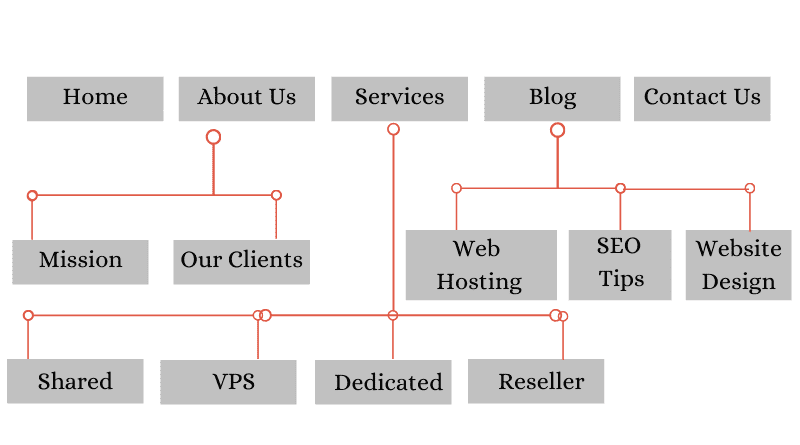
In the above image, the Home, About Us, Services, Blog and Contact pages are the main pages. To access the Mission and Clients pages, you need to visit the About Us page first.
The Importance of Navigation on Your Website
As mentioned previously, 50% of internet users can’t use a standard menu correctly. Can you imagine how few people will find the right content with no navigation at all?
By creating the navigation and menus correctly, this percentage can be cut down. This will help in decreasing bounce rates, increasing your average time on site and increasing traffic, leads and customers.
Related: 5 Website Elements That Can Cause Serious Website Accessibility Issues
Discover the Types of Navigation
Below are the three main types of website navigation:
- Global Website Navigation
- Hierarchical Website Navigation
- Local Website Navigation
When you combine all three correctly, they help your visitors to navigate your website and find their required content easily. Let’s dive into details of each one.
Global Website Navigation
Global website navigation helps in matching the menu and the links across all pages of the website. Many websites have designed menus in a modern way, including the menu of our very own site here at MilesWeb: if you scroll down the page, the menu will follow.
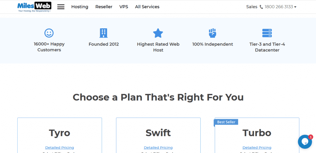
In the screenshot, you see the simple and easy to understand header menu. You will find this menu on all our pages and it takes you to some of our most important pages and content.
It is important to display the crucial information a prospective customer wants to know about a hosting company prior to making a decision. Therefore, it is important to make easy for potential customers to find our services, features, and contact us. Additionally, for existing users, we have also displayed the login option to let them log in to their MilesWeb hosting account.
Our footer menu also is a type of global navigation and comprises essential sections of our website and support and payment options.
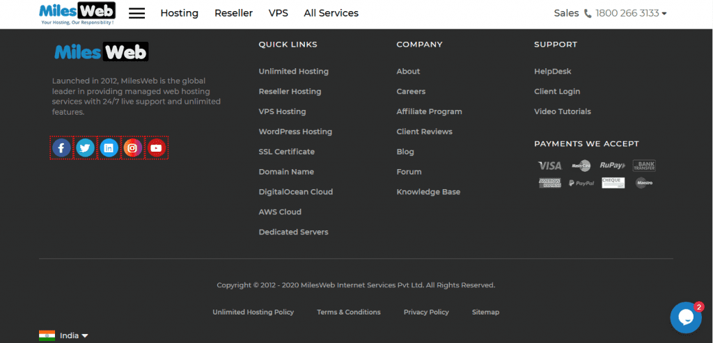
Global menus are the standard format for several CMS solutions.
With every WordPress theme, you get different types and areas for navigation menus. For more navigation options, you can use a menu plugin.
Hierarchical Website Navigation
In Hierarchical navigation, the menus change as per the context of each page.
Mostly the websites related to newspapers and purely content-based ones use hierarchical navigation. For example, in case you visit the top page of a newspaper, the links are typically directed to the top news categories in the header menu.
Example of hierarchical navigation from the NYT:

In the global menu navigation, the menu remains the same after clicking to a different category. But in hierarchical, it discloses new links that direct users to subcategories of the category page they visit.
The above screenshot of the New York Times’ Technology page doesn’t display the top-level menu at all. Instead, it displays the links to different sub-sections of science research and articles.

This is the change that separates this menu from a regular global one can be found on several smaller sites.
Local Website Navigation
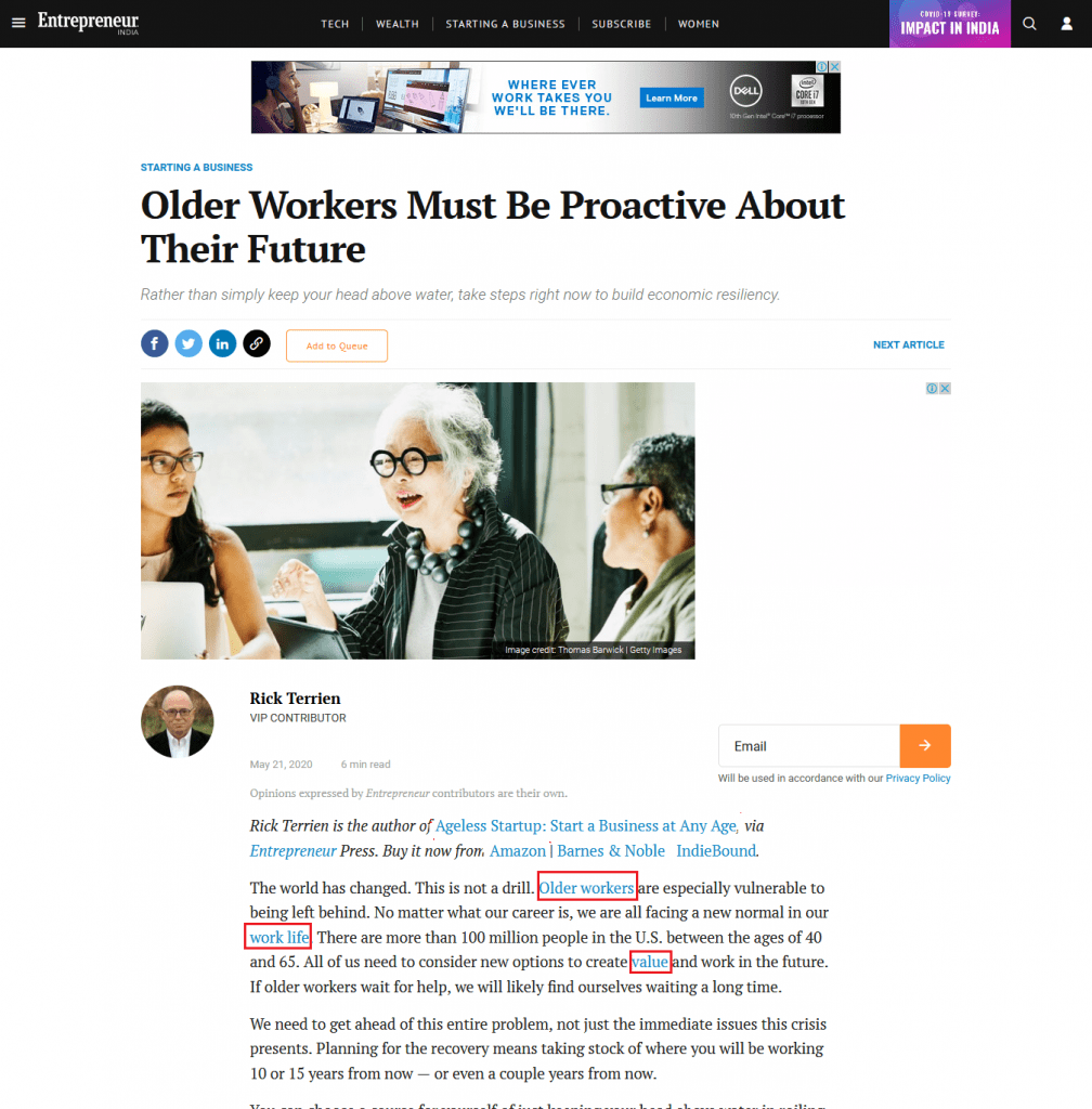
On the contrary to both global and hierarchical navigation, local website navigation involves internal links that are included in the content itself. Generally, the user gets options at the same level of hierarchy or one level deeper, or links to navigate to other relevant pages.
You can check the magazine websites for this, which often use links so that the readers can explore the deeper context of a certain article. In case there is an incident covered in the past, they will link to that article, rather than explaining it in-depth.
Entrepreneur.com is one of the best examples of this:
Apart from magazines and news websites, even ecommerce stores use this type of navigation heavily to display the products in the same category.
Generally in SEO, internal linking is also a crucial aspect of SEO and to be more specific WordPress SEO, now it is a standard practice for anyone who manages a website.
Website Navigation Examples
Just going through the theory part isn’t enough, let’s check some practical examples. Check the example of MilesWeb website.

If you just take a look at the image above, you will find that the MilesWeb is mainly using a single, global header menu for their categories.
But you are wrong. They have used all types of navigation across multiple category pages and millions of articles.
Types of navigation used:
- Hierarchical.
- Global.
- Local.
Check below the different header navigation for each page:
Homepage
If you check the header section of MilesWeb’s website, there are two menus, one expandable global menu besides the logo and a hierarchical menu in between the header and the hamburger icon. It appears similar to header and sub-header menu.
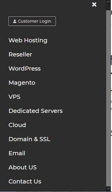
After expanding the header hamburger menu, it opens as a sidebar on the left-hand side, where there is a wide margin comprising of other services offered by MilesWeb.
Homepage (Mobile)
Let’s check the same header section on mobile. Since majority of internet users access websites via their smartphones, it is important to make your website mobile responsive. It means you need to offer a better user experience as compared to the desktop one.
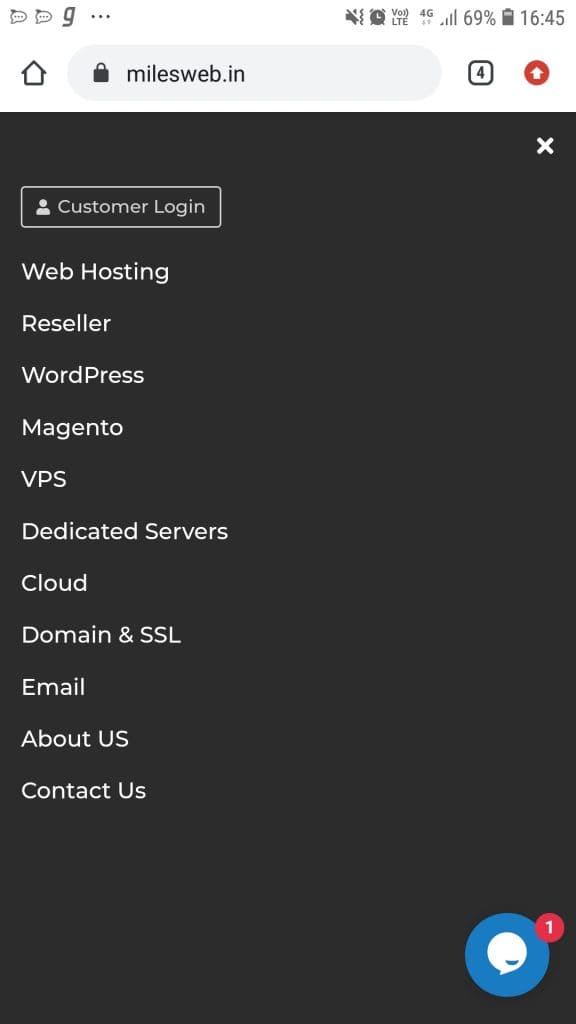
The sub-header menu isn’t displayed on the mobile. Instead, you just get the hamburger menu on the mobile.
When you expand it, it utilizes the full-screen menu and completely covers all the content on the homepage.
You will find every option included in it from the main menu on desktop as well as the links are neatly organized by category.
Category Page
On the MilesWeb’s blog page, below the header hamburger menu, the arrow slider takes you to further categories.

With this, people who are interested in a particular topic will easily find articles that match their interests.
Category Page (Mobile)
If you check the MilesWeb’s blog pages on mobile, you will see the same header hamburger menu and structure as on the desktop.

Single Article
Here we will take the example of NYT. When you are browsing an article, you will see the floating header that shows the section in which you are currently present but only the expandable global menu is seen.

Single Article (Mobile)
When you check the article on mobile, you will find clean navigation as the only the header hamburger menu gets displayed.

Footer
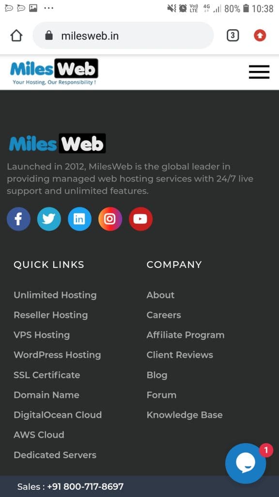
The footer menu of MilesWeb is almost the same across the homepage, category pages, and single articles.

Footer (Mobile)
The footer menu on mobile is same as that on the desktop for homepage, category pages, and single articles.
Content Layout
There can be an argument that the primary navigation tool used by online newspapers and blogs isn’t just the menu. It’s actually the content layout itself that provides the navigational pillar for such sites.
All the elements highlighted in the image are clickable and direct you to different internal pages within the Entrepreneur website.

Content layout acts as a key element of website navigation and that is seen implemented by Entrepreneur across their home page and category pages.
What Makes Good Website Navigation?
When you see a good website design, it has been designed by considering the user’s point of view. It comprises of simple, easy-to-understand language and links to the key pages.
A good website design comprises of enough white space, use of different colors, or other design techniques for separating different types of content. This also makes it easy for users to read on all types of devices.
Navigation based on users’ perspective requires user experience and expectations. Therefore, online newspapers still have “crowded” design.
While reading a newspaper, therefore, the expectations of their users and potential customers are met including the extensive menus of categories and sub-categories.
8 Principles for Improved Website Navigation
Even if you’re a complete beginner, you’ll be able to nail the navigation for your website by following the tips below.
1. Page Structure and Navigation Planning
Prior to getting started with writing content for your website, you should plan out your page structure and navigation.
It is important to plan the process of providing satisfactory navigation to your visitors. A sitemap creator will help you to quickly create mockups for making your website experience as you want it to be.
2. Ensure Established Standards are Followed
Don’t try reinventing anything. Website navigation is highly focused on usability than creativity.
Known standards are followed by essential design elements which include the location of your menu and displaying the way it expands.
One of the most popular icons for determining an expandable menu is three horizontal stripes, or the “hamburger” sign. Also, the three dots creating a horizontal line is another popular option.
In case you develop a custom icon using your creativity, there are chances that many visitors won’t understand the purpose of your design. Moreover, they will switch to other website, if they don’t find your menu.
3. Make Use of Your Users’ Vocabulary
Ensure that you use the language that is easy for your users to understand and search for the needs. Don’t simply link to some of the pages by following the standard web development format.
This will benefit both users as well as SEO. Learn about what your users are searching for online and create pages accordingly.
Those same pages can be linked using the words and phrases that users entered while finding your website on Google.
4. Responsive Menus are a Must
Today, over 52% of all online traffic is on mobile and so, responsive/mobile-first design is an absolute must.
Create expandable mobile menus to avoid those going out of the frame in mobile web browser or appearing too cluttered.
This has become an industry standard. If you use horizontal menus with tiny text, users won’t be able to read, click on it or find the desired content.
Almost all the WordPress themes are responsive and offer responsive menus by default and so, WordPress has already got your back, if your website is based on this great CMS.
Related: How to Make Your WordPress Website Mobile Friendly
5. Use Your Footer Menu to the Fullest
Readers that go to the end of your website while reading or scrolling are more interested as compared to average users. So, use the footer to the fullest to highlight valuable content.
Because the footer doesn’t use the “above the fold” space, you can narrow down your content and display multiple categories and also highlight some important pages or articles.
For example, take a look at our footer on this page. We have included the types of web hosting services, about, blog topics and more.
Basically, you can emphasize the content that you weren’t able to fit into your header.
6. Use Color and White Space to Differentiate Navigation
Colors, white space and fonts help in separating your menus from your main content and sidebars. Ensure that user understands the start and end of navigation.
The language used in your menus, or the pages you link to doesn’t matter, if your website visitors aren’t able to find the menu instantly.
7. Don’t Always Use Dropdown Menus
Dropdown menus aren’t suitable to all websites. When there is a link in the menu, it is assumed to be clickable by users. If the design doesn’t separate the menu from the clickable links, it can be confusing for all.
Too many links in your main menu can also have a negative impact on the usability of your website.
If hierarchical and local navigation is used instead of dropdown menus, it will offer smoother user flow. With this, users can interact with multiple pages and spend more time on your site, rather than browsing through a big confusing list of links.
8. Make Your Structure Flat
In case you want to make the website navigation easy for your visitors to browse all your website pages, ensure that your navigation structure is flat.
Don’t link to just a few pages from your home page and then expand with more sub-pages and categories.
Link to significant categories from your homepage and a single layer of sub-category or single article pages from there.
This will help in boosting your SEO as well as lead to Google sitelinks. So, keep your website structure as simple as possible.
Summing Up
Hope this post gives you a clear understanding about website navigation.
Website navigation should always be based on simplicity, clarity, instead of intense colors and creative design. Also, you should consider both desktop and mobile platforms in terms of website navigation. It would be better to get things done from a web developer.
Even in future, usability and clarity will be on priority for website navigation. So, in case you understand your user’s perspective and create a structure that they find it easy, you will surely become a master very soon.


