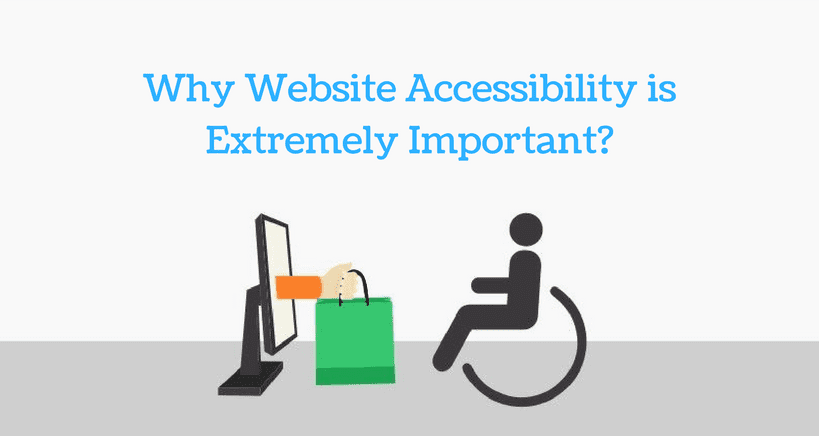
At times, the aesthetics and impressiveness of a website might have nothing to do with the user-friendliness and usability of the website. Setting up a website with a great look and feel is no longer enough to ensure visitor satisfaction. The right combination of website look and usability is the key to winning hearts. While browsing the net, you might come across many websites that look visually appealing but lack on the usefulness factor.
The most important factor for ensuring better accessibility of the website is to give priority to website content more than the website design. A website might look stunning with the use of great colors and with a great design, but is the website content is not properly arranged, it might leave a user confused. In this situation, the user might appreciate the website design, but eventually he / she will leave your website in search of more useful website.
Website accessibility has got more challenging in the modern times because of wide range of mobile devices are being used and also because of a variety of web browsers. Accessibility and usefulness of a website are core factors of website design and they should be focused on before deciding the look of the website.
Here’s how you can ensure website accessibility and usefulness:
Select A CMS That Supports Website Accessibility
There are many content management systems out there to choose from for setting up your website. the most commonly used CMSs include WordPress, Joomla, Drupal etc. Once you have selected a CMS that suits your website needs, make sure to choose a theme of template that is properly accessible. Go through the documentation of the theme and checkout points for accessibility and information on creating accessible layout for that theme. Apply this principle while selecting plugins, widgets and modules as well. The options provided by a CMS like publishing a blog post or posting a comment should be properly accessible as well.
Use Headings Perfectly To Organize The Structure Of The Content
The users who are avid screen readers can use the heading structure for navigating through the content on your website. By using proper heading tags like <h1>, <h2> etc. the content of your website will be perfectly organized and website users will be in a better position to easily interpret the website content.
Ensure that you are sticking to the correct order of headings. The content presentation can be separated from structure through CSS (Cascading Style Sheets). Do not pick a header only because it looks good; instead, create a new CSS class for styling your text.
Here are some heading examples:
- Use the <h1> tag for the main title of the page. Do not use the <h1> tag for anything else apart from the title of the website and the title of website pages.
- Use headings properly to organize the content structure of your website.
- Do not avoid the heading hierarchy <h1> – <h2> – <h3>, otherwise the website users will get confused with the titles and content.
Suggested reading: 13 Terrible Web Design Mistakes
Use Appropriate Alt-Text For The Images
Just like you optimize the content of your website, it is also important to optimize the images. This is an extremely important factor for the images that portray direct information – like infographics. While creating alt-text, make sure that your text contains the message that you would like to convey through the image.
There can be an exception to this rule when the image is solely used for decoration purpose. In this case, there is no need to add anything as alt-text.
If some image is the primary content of a link, the website user will read the file name if alt-text is not defined. It is necessary to define alt-text for the images that are used as links.
Use Tables For Presenting Tabular Data, Not Just For The Layout!
Use of tables for the sole purpose of page layout is like additional content for the website users. Whenever a reader sees a table, the general perception of the reader is that there is a certain number of columns and rows; therefore, it is important to live up to the expectations of the reader. Also, it might happen that the content might be read in a wrong order that is not in sync with the order of the page. Therefore, avoid creating the layout of your website using a table; instead, you can use CSS for presentation. Use the table format only if you have genuine data that has to be presented in a table format.
Ensuring website accessibility and usability is the need of the time. You can retain the new website uses only through a functional website. Implementing small and easy website accessibility steps will go a long way in establishing brand loyalty.
Do you wish to create a great website? Start your venture with MilesWeb, go through the wide range of web hosting solutions and select the best one for your website.


