Get ready, online shoppers and sellers! Black Friday is just around the corner, and it’s time for all online businesses, big e-commerce giants or small online gift stores, to prepare. Black Friday deals are a great way to get your business going and mark the best-to-date profits.
Black Friday is a globally observed day marking the holiday shopping season. It is not just a seasonal shopping holiday event, but it also marks the biggest day of the year where businesses with the best web hosting services push for high sales and make a memorable impression on the customer, and the most interesting thing is that effective Black Friday website designs will help you reach your desired goal.
Businesses can create an unbeatable Black Friday shopping experience just by using strong Black Friday web hosting deals, amazing eye-catching Black Friday sale images, and design inspirations.
Starting with an elegant Black Friday website design, boldly communicating Black Friday flyer designs, and practically everything in between, your marketing campaign can bring you the top conversion rates. In this blog, we will relive 2024’s best Black Friday design ideas for your website and other needs. So brace yourself up and stick to the blog to learn all the essentials.
Table Of Content
What is Black Friday?
Do you know the tradition of using black ink to record profits on balance sheets after a successful sales day? Well, that’s the well-known reason to use black color. Thus, retailers, e-commerce websites, and other online businesses make huge discounts and create Black Friday design inspirations by combining black colors with others.
What are Black Friday Design Ideas?
Now coming down to the most-awaited part, “What are Black Friday design ideas and trends?” First of all, Black Friday design concepts can be described as various design aspects and promotional tools aimed at popularizing the Black Friday event.
In simple terms, any web designs, social media posts, flyer designs, logos, banners, and newsletters, among others, used to promote sales are called Black Friday design ideas.
The overall goal is to produce good-looking campaigns that are consistent, effectively capture consumers’s attention, and keep them interested. This potentially results in traffic and sales. All in all, we can say that the Black Friday design ideas consist of a large number of items that are visually appealing as part of a marketing campaign.
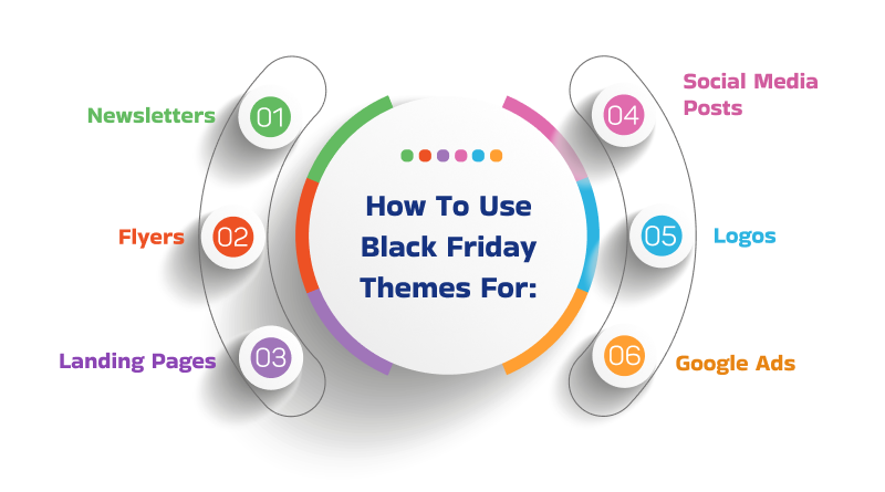
How To Use Black Friday Themes For:

1. Websites
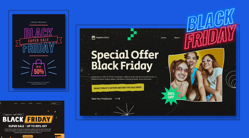
When you are developing a Black Friday website design for showcasing your competitive deals, it’s best to create a separate landing page for it. Create a good graphic interface for the web pages in order to publicize the Black Friday offers.
Key Features To Remember
- Create a dedicated landing page.
- Use a striking color scheme.
- Optimize for mobile.
- Use countdown timers.
2. Flyers
Black Friday flyer designs are an easy and quick way to inform customers about particular offers and products. Plus, an interesting Black Friday picture adds more glamour to the design and lures us to visit the store or the website.
Key Features To Remember
- Use high-quality images.
- Include a clear call to action.
- Offer exclusive deals.
- Use a consistent design.
3. Logos
Black Friday sale logos are used as a tactic in Black Friday design inspirations. Here the designers combine and create unique logos of Black Friday that link with the promotion of the companies.
Key Features To Remember
- Create a unique Black Friday logo.
- Use a bold and memorable design.
- Use consistent colors and fonts.
Similar to the above Black Friday web design elements, you can also utilize themes for social media posts, newsletters, Google Ads, and more. Here are some instances:
4. Landing Pages
Make sure that the necessary amplitude of landing pages is provided. Furthermore, they should be adapted for speed and for viewing on the screens of portable devices. Choose a dark theme with large flight headings and easily recognizable CTAs (call to action). Use countdown timers so as to establish a sense of scarcity.
5. Social Media Posts
Make use of dark backgrounds with killer images and text/fonts. Since it is possible to advertise many deals, leverage platforms’ built-in features, such as stories and carousels.
6. Newsletters
Make your newsletters look a bit spooky and go for black or as dark a color as possible for your text, where appropriate. ‘Engage’, which is the most effective for raising the open and click-through rates, contains personal and targeted messages, bonuses, and offers.
7. Google Ads
When designing the display ads, it is recommended that the themed colors be black with a hint of highlight color. A strong call-to-action ensures that your ad copy is clear and concise.
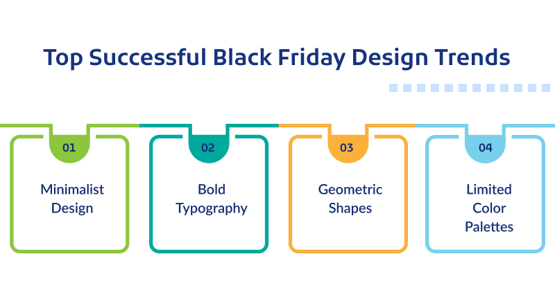
Top Successful Black Friday Design Trends
Last year was another successful hit for Black Friday deals utilizing the best of UI/UX design trends. Here are some of the most trending Black Friday design ideas that ruled the revenue market.

– Minimalist Design
A minimalist design approach has been seen in various platforms. Often, web designers favor simple and uncluttered designs, focusing on the primary elements (content, intent, and goals) of their designs.
– Bold Typography
Big, bold, and invasion of the banner-like font and typography choices were seen. Typography trends were highly taken into consideration while developing the Black Friday website design.
– Geometric Shapes
A lot of shapes were used in some of the popular Black Friday design ideas to make it postmodern and aesthetically pleasing.
– Limited Color Palettes
Colors have an impact on web design trends. Hence, designers choose to play with limited color palettes that complement the deals and intent of the page.
Why Is Black Used? (Themes, Fonts, & More)
Is it the dire rule to use black when it comes to Black Friday design ideas? Necessarily not, but using black themes, colors, and typography elements helps with human psychology. Thus, when this color is used in Black Friday design ideas, it conveys a strong message of limited availability or exclusive offers that encourages customers (human psychological effect of black color) to act quickly. Further, it makes other complementary colors pop up and attracts the attention of the viewers.
Both customers and sellers benefit a lot from Black Friday deals. For consumers, it’s an opportunity to buy goods at a cheaper price, and at the same time, for businesses, it’s an opportunity to make huge profits.
In many ways, black assists in creating a perfect classic, serious, and luxurious environment for premium brands and products.
It also acts as a backdrop that does not distract the viewers’ attention, as the other design choices, such as fonts, images, and buttons, can blend in. Here are a few reasons why black is preferred while designing Black Friday deal offers.
- Increased Sales: Black creates a great impact of increased sales for businesses and helps in achieving the set targets.
- Customer Acquisition: Generally, the color acts as the reserve of new clients based on excellent and unique sale offers and bonuses.
- Brand Awareness: We all know the never-ending trend of black color in brands. Whether it’s a clothing brand or web design trend, black is a surefire way of increasing brand awareness and perception.
Most Popular Colors, Strokes, and Fonts in Black Friday Sale Images
| Colors | Black, Red, Gold, Silver, Deep Blues | The color red is usually associated with a limited period left or the product being on discounted offer; gold has a kind of royalty feel to it. |
| Strokes | Bold, Thick Strokes | Using thick lines around any text or image draws attention to specific details. Outlines create depth, as well as drop shadows. |
| Fonts | Sans-Serif (Arial, Helvetica, or Roboto) | The use of modern, elegant, and well-known fonts such as Helvetica, Arial, or Montserrat—all sans-serif fonts—gives people a sense of familiarity. |
Best Black Friday Website Design Examples
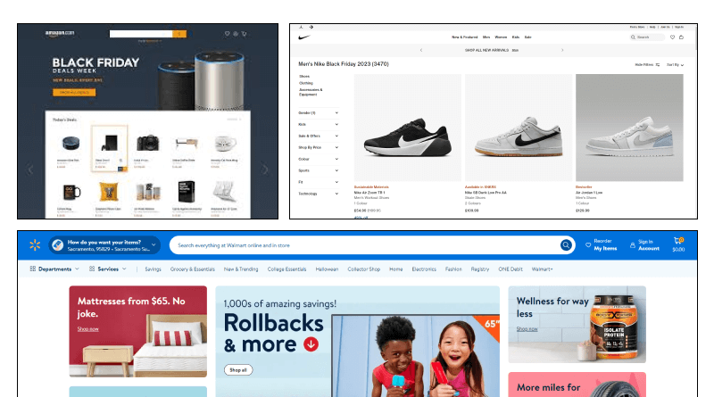
Every year, web designers need Black Friday design inspiration to build a website from scratch. Here are some of the most loved, relevant, and impressive Black Friday website design layouts discovered on the Black Friday promotions.

- Amazon’s page is an excellent representation of the best Black Friday landing pages, which are a case in a minimalistic approach that focuses heavily on product images and simple navigation systems.
- Best Buy uses a black background with blue and yellow contrast, offering them a conspicuous and, at the same time, elegant look.
- Nike is famous for its minimalist black-and-white designs with typographic statements that evoke patented scantiness.
- Walmart uses a mix of black and red, with large CTAs and clear product categories for an efficient shopping experience.
It is critical to understand a thing or two about design to make the most of Black Friday deals. Similarly, the correct use of images and an interesting shopping experience increase a brand’s identity in the long run. In addition to that, evaluating different firms, retailers, and companies can improve your sales.
It is expected that Black Friday 2024 will also break all previous records, and your design plan is going to become one of the decisive factors. In designing the web, graphics, flyers, logos, or any other marketing material, if one pays attention to the latest trends and the black-colored themes and consistently monitors them, then it can prove to be very successful.
Integrating these design ideas into Black Friday design ideas and creations, not only makes them effective but also phenomenal.
FAQs
How can I create a compelling Black Friday landing page?
1. Keep the design clean and uncluttered.
2. Use strong, contrasting color schemes.
3. Include a clear call to action.
4. Put up a countdown timer indicating when the offer ends, creating urgency.
How can I design a memorable Black Friday newsletter?
Customize content as per the client’s preference. Make offers that are only for them. Choose an attractive email subject line. Add a CTA button.
How can I ensure my Black Friday designs are mobile-friendly?
Design cross-platform mobile responsiveness for various screen sizes and optimize images for these devices. It is recommended that you test your designs on different devices and browsers before launching them.


