
Designs and colors play a crucial role in enhancing the user experience of websites. Launching a website with the help of web hosting is easy but color palettes are crucial to determine the page flow of a website. Color palette helps boost the brand value and maximize the user’s attention span of the website. As a result, the bounce rate decreases.
Blue is the prominent color code that many IT companies use. They use a blue website color palette because the particular color is associated with stability and success. Also, it shows intellectualism and calmness. Likewise, pink color swatches are associated with kids or feminism.
So, if you are a beginner looking for the best color palette for your website in 2025, we have brought this guide. Pick the right brand color palette for your online presence for better UX.
Table of Content
What is a Color Palette?
A color palette includes a full range of colors which is displayed on the device screen for a better user experience. There are many designing software using color codes (for example #ff0000 is for red in HTML) that give a compelling website design appearance.
Uses of Color Palette
Color palettes help UI designers to mix colors and different website color schemes. As a result, they come up with new colors that give the brand a competitive edge. Color palettes help designers to pick the right color for the website to enhance its visual appearance.
Traditional color palettes had only primary colors like RYB (Red, Yellow, and Blue). They used hexadecimal (HEX) values to represent and select the variety of colors present in the system.
HEX codes communicate computer which color does device wants to display to users. In the early 90’s decade, only eight colors were available which has spiked to 4,096 colors. Hence, designers have a range of different hues and shades from the color wheel to choose from.
Different Types Of Color Palettes
1. Monochromatic
Monochromatic color schemes include different shades and tones of single color. It is a popular choice of web designers who use this palette in designing menu boxes for a website.

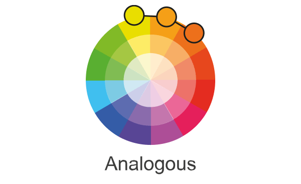
2. Analogous
Web pages or website banners mostly use analogous color schemes. This is because the color palette uses fewer contrast colors. It is formed of three colors located next to each other on the color wheel.
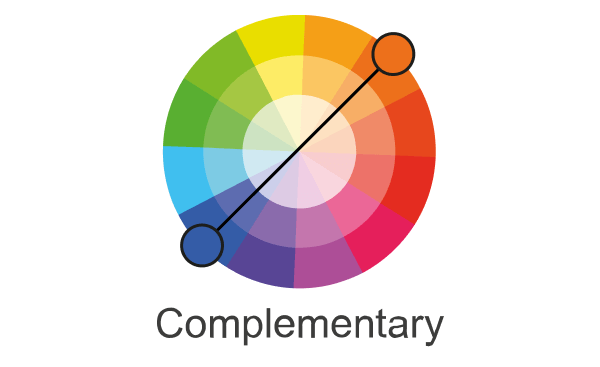
3. Complementary
Complementary colors consist of opposite colors in the color wheel. Opposite colors are placed in front of each color. For example, if there is a dark background and a contrasting bright color button, it will automatically get highlighted and hold attention.
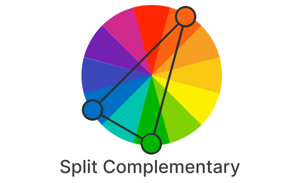
4. Split-complementary
In contrast to a complementary color palette, split-complementary uses more colors. For example: if you choose blue color, then take two adjacent colors to their opposite colors. Yellow and red would be those.
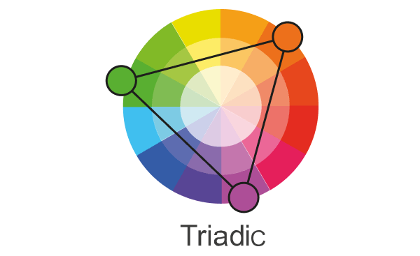
5. Triadic
The triadic color scheme consists of three separate colors which are equidistant on the color wheel. Many web designers use this color scheme by choosing one dominant color and the other two as accents. Accent colors are secondary colors that contrast or complement the primary colors in a room.
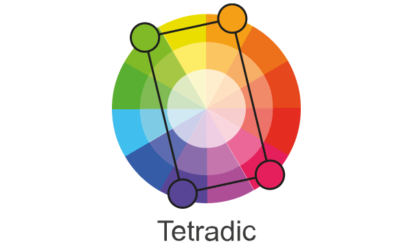
6. Tetradic
A tetradic color palette is a color scheme that contains four colors that are equally spaced on the color wheel. Tetradic forms a rectangular pair of colors in the color wheel that gives a visually stunning design effect. However, only experienced designers are using this color scheme.
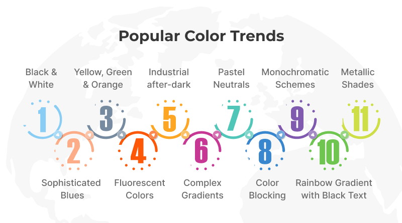
Popular Color Trends for 2025
1. Black & White
You might think that black and white are normal colors to build average-quality websites, but they provide vibrancy if added with other color schemes. Internet users are aware of websites having bold text.
Not just websites, even your smartphones have day and dark modes with black and white vibrancy. Both colors reduce eye fatigue and save battery power. Now, I am not saying it is mandatory to use this color scheme everywhere. Only use them for bold statements or phrases on your website.
2. Sophisticated Blues
Blue color portrays calmness and brilliance but it is with deeper and sophisticated tones. The respective color has introspective shades because of which fashion, décor, and IT industries are using it. Even MilesWeb’s website pages are using blue shades giving a higher user experience to our website visitors.
All in all, blue evokes a sense of timeless elegance through its different shades. Besides websites, there are many free WordPress themes and WordPress plugins have blue colors in their interfaces.
3. Yellow, Green, and Orange
We are talking about the trio of yellow, green, and orange that will give bright pops to your website. This color palette gives a visually mesmerizing experience by combining Pantone 2025 color of the Year, Apricot Crush. Any environment-related websites or EV (Electric Vehicle) manufacturers’ websites may use this color shade.
Combining these color schemes gives a luxurious look to your websites and engages users to browse websites thoroughly. Hence, these color combinations will inspire and give an organic feel to your website.
4. Fluorescent Colors
I like fluorescent colors because it gives me a nostalgic experience of my childhood. Fluorescent colors are highly bright versions of primary and secondary colors. They are also known as neon colors. If you want to see the neon effect on the VPS hosting landing page check its header image.
Fluorescent color schemes include fluorescent orange, fluorescent yellow, lime green, pink, and many more. Adding these colors to websites grabs attention and adds excitement and energy to a visual. They can also be used to create unique color palettes.
They can reflect 200%-300% of color while conventional colors only reflect up to 90%. Few strokes of fluorescent colors in ads, signboards, or images will hook the users’ attention and excite them to engage with visuals.
5. Industrial after-dark
I thought the industrial after-dark color palette is a retro color scheme but it will have its presence in 2025. Many movie posters or web series thumbnails are using this color scheme. The palette includes different color combinations like bloody reds with orange/black, or silver and yellow.
With gritty contrasts and distinctive features, these fusions are warmer and attention-grabbing. A prominent example is a SALE billboard or poster. Have you wondered about which color is it made of? It is mostly red and white. Different contrasts of color help the brand feel more grounded, emotional, and soulful.
6. Rainbow Gradients with Black Text
Black and Rainbow gradients might be a confusing color combination in your mind. But Stripe is one of the leading eCommerce payment gateways that is using it. Attractiveness and a higher user experience are some major factors that will be added to this color gradient. Black texts on the other hand will create a boldness factor.
Coming back to our example, if you browse the Stripe payment gateway website, you will experience that categorization using this scheme is helpful for categorization. Using the color combination in features and services box sections is helpful to make it a different look from another website layout.
7. Complex Gradients
Have you seen marble texture? How pretty multi-color gradients are available in it! It will give a different look for websites also. Having this texture in the background will give your website a distinctive look. Gradient backgrounds create visual interest because they take viewers on a journey from one color to another or from shade to tint.
Many websites have motion graphics and users have less attention span. Thus, complex gradients help in increasing the attention span. The icing on the cake will be Lightroom touchups, images become more charming with an overlay of gradient.
8. Pastel Neutrals
Pastel Neutrals is a color combination of soft and muted tones. In this combination, a gentle and elegant color palette are delicate hues that gives your website design a complex and timeless feel. Not just pastel color backgrounds but typography texts are also helpful in enhancing the website’s visual appearance.
Pastel typography is one of the best typography trends that will boost the user’s experience on your website. These color palettes have enough white mixed into them to take away the saturation and turn them into a pale version of colors.
9. Color Blocking
You can use color blocking on your website by using large, bold blocks of contrasting colors. Your design can be visually striking and playful with this trend.
Find the right color combination and block size for your website by experimenting. Brands who want to showcase their creativity and modernity will love this trend.
Combining various vibrant colors in large, bold blocks creates captivating, high-contrast visuals in this website design. You can use color blocking with any color scheme, whether it’s pastels, bold shades, or monochromatic.
10. Monochromatic Schemes
The monochromatic color scheme has been popular for some time, but it is expected to remain so in 2025 as well. In this trend, shades of the same color are used to create an elegant and cohesive appearance.
As monochromatic colors can be paired with almost any color, they are one of the most versatile website design color schemes. For brands wanting to showcase their attention to detail or create a sleek and modern aesthetic, this trend is perfect.
11. Metallic Shades
Metallic colors can be used in web design to create contrast and draw attention to important elements. They can also add a touch of luxury, elegance, or sophistication to designs. The colors evoke emotions, convey brand identity, and guide users’ attention.
Metallic color shades help us to process and store images more efficiently than colorless (black and white) images. This can help increase brand recognition and help prompt visitors to your site to take action. Dark blues and greens are your best bet for making your website appear comforting and welcoming.
Top 3 Color Palette Tools For Business
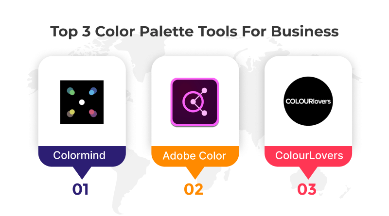
There are dedicated color palette tools to give your websites a visually appealing look with many features. Here we mentioned the top 3 names for you.
1. Adobe Color
Our first choice is Adobe Color because it has less technical features and user-friendly navigation. Another good part about it is its open-source nature which makes it free for all. So, whether you have an Adobe subscription or not, Adobe Color will always function on your system. Generate different color palettes according to requirements.
Key Features
- Color schemes: Users can create multiple color schemes and edit themes up to ten colors in a few clicks.
- Color wheel: Choose a base color for your theme and apply options to achieve a theme. The Adobe Color Wheel includes ten color harmonies, three color modes, and a color theme library.
- Color harmony mode: Create gradients, check contrast ratios, and match colors to a mood.
2. Colormind
Colormind is the next color palette generator that is the second name in our list. With this tool, get a preview of how will your website look after applying the color scheme. Overall, the simulation part is best where website designers can make changes and build a brand’s credibility with compelling designs.
Key Features
- AI-powered generations: Colormind uses deep learning technology to generate customized color palettes. It has a massive dataset of existing palettes and creates new beautiful and unique ones.
- Color harmony: Colormind takes into account the principles of color harmony when generating palettes, so you can be sure that the colors will work well together.
- Accessibility: Colormind palettes are all WCAG-compliant, which means that they meet the Web Content Accessibility Guidelines.
3. ColourLovers
ColourLovers is not exactly a color palette generator but a community where different ideas and palettes are shared. Different design elements, blogs, or color schemes are available in the community. The major limitation is that beginners will find it challenging to access this community as all professionals are its members.
Key Features
- Massive library: Browse over 4.9 million user-created palettes organized by themes, feelings, moods, and popularity.
- Save and share palettes: Publicly share your creations or keep them private for personal use.
- Finding inspiration: With its vast library of palettes, you’re sure to discover colors that spark your creativity.
I have written this blog to give you major color palette trends for 2025 that will make your website outstanding. Different hues, shades, tones, and gradients will add value to the website by enhancing its appearance. Always remember that the first impression is the last impression and website visitors will engage only with compelling designs and color tonality.
The secret formula to your website’s success is to choose the right color according to your brand voice. For example: Red and Yellow is a good color combination for the food/beverages industry. We have the example of McDonald’s. Hence, pick the right color palette or share this blog with your designer geeks to guide them in the right direction.


