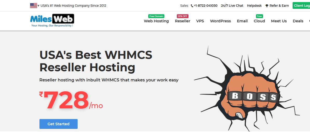
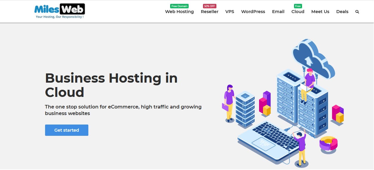
Good character design tricks will help you to create smart web designs. A creative mind is all you need to have and you will do a great job at flat principle designs or digitally re-produced real life objects.
Illustrations in web designs have their own trends. For instance, there is a trend of showing cartoon characters in the hero section. You can see this trend almost everywhere.
The reason behind the popularity of this trend is that both old and young people like cartoons. Since we were kids we were used to learning things from animated movies, this trend was less popular earlier but now it has taken the center stage. Cartoon characters can make people curious and they can also explain things easily. Cartoon characters can be ideal for the websites that have a non-tech-savvy audience in order to simplify explanations.
Here are some great character design tips:
Cartoon characters can best support the messages that you wish to convey to your audience. They help in improvising the user experience and ensure a great online experience on your website.
#1 Make Use Of Human Characters
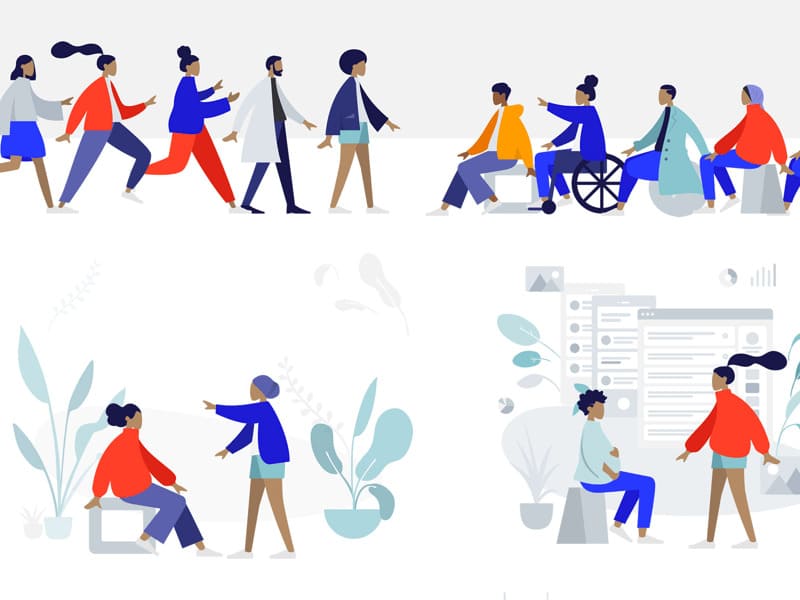
Irrespective of whether you have an online service that enables the tech-savvy people to be more efficient or if you have a web application that helps people to manage their businesses; there are possibilities that these people might find it confusing to explore new websites. You can make use of human characters in order to overcome this hindrance. Using a human character will surely make things simple for the users.
For instance, you can place human characters like the ones shown in the image on different places of the website.
#2 Make Everything Clear
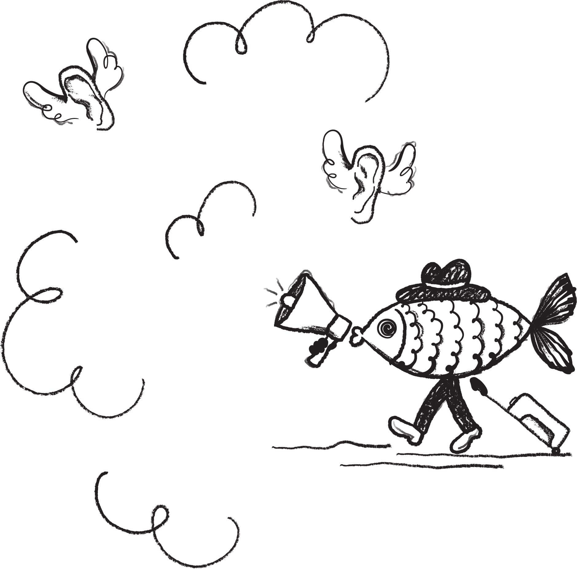
At times, all you have to do is be extremely honest; ‘clarity’ is an important attribute in every web design. We all appreciate the projects made with great detail; but there are some situations when it is preferable to make things obvious. Through the website you need to convey to your audience that what you see is what you get! Your honesty should be evident. In order to avoid the users getting confused, the illustration that you use should clear things right from the beginning. Do not use a character or a cartoon that spikes the curiosity of the users as it might end up confusing the users at times.
Have a look at the picture given below; if such an image is used on the website, it might confuse the users.
#3 Make Use Of Cartoon Animal Mascots
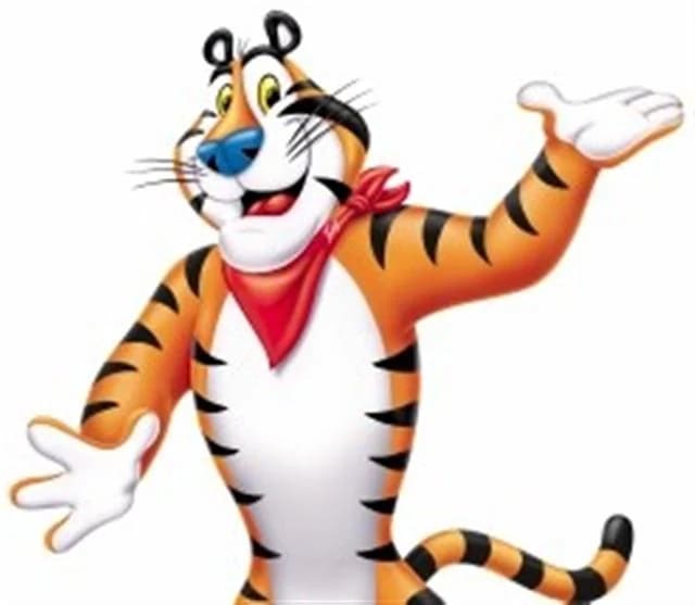
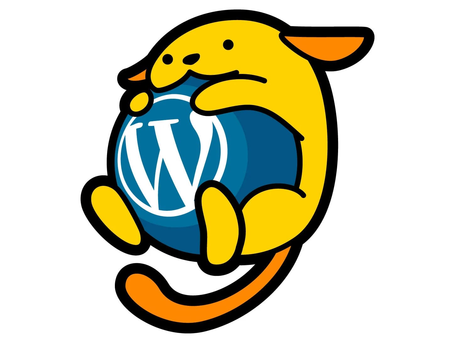
Even if your business does not need any introduction, you need to do something to make it unique. You can do this by using a smart character design on your website. A great way to go about doing this is by using a funny animal mascot that holds the interest of your website visitors and users. You can also use the mascots shown on your websites in your hoardings, pamphlets during events.
Have a look at some animal mascot examples that you can use:
#4 Show The Routine Things With Animation
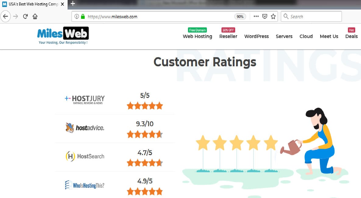
Using animation has become a popular trend now. Various kinds of animations are used for catching user attention. It is not necessary to use big animation; even a small and smart animation can be highly impressive. Create animations for your website in such a way so that they support your brand. You must create an impression on the users and at the same time you should be careful that your animation does not intimidate the user.
Examples of very creative animations on MilesWeb website:
#5 Instill Confidence By Using A Superhero
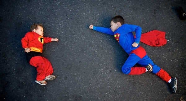
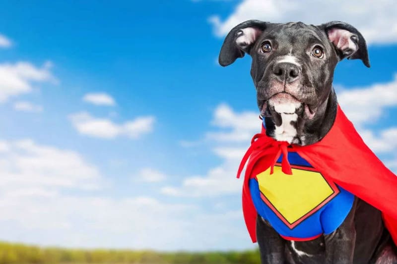
To be honest, everyone can relate to a superhero. Superheroes have an impression of doing the incredible stuff. Even though the users coming to your website are adults, they will surely love to see a superhero depicted on your website. You can certainly use a superhero for enhancing the user bonding.
Now, use of superhero characters does not always mean literally using superhero images like superman and batman.
You can create a superhero character that is relevant to your website topic like the ones shown below:
#6 Experiment With Different Styles
Illustrations, characters and animations have to be creative and you have to be at your best for crafting impressive styles and illustrations. You don’t have to follow the stereotype as long as you are doing justice to your mainstream. On the basis of the purpose of your website and theme of your website, you can craft different illustrations according to your imagination. The audiences nowadays are advanced and they will surely appreciate something new.
Here are examples of some very creative and apt website illustrations:
Conclusion
It is true that we operate in a professional world and your website should have the same feel as well, but there is nothing wrong to lighten the mood a bit by adding some interesting characters, animations and illustrations. Even a small cartoon character used smartly can be a powerful tool in terms of holding the attention of your users. The thing about cartoon characters is that they can be playful and adorable and users can relate to them right away. Use of the right characters at the right place can bridge the gap between you and your users and thereby you can create a great online experience for your users.

