Digital transformation is essential for every business’s survival, as people find more convenience in online shopping. A business must invest in developing a professional website for a seamless digital presence.
The website should ensure two things to the visitors:
- User experience
- User interface.
If the User Interface (UI) is not impressive, a website will experience a low conversion rate. In other words, your website might be receiving a considerable amount of traffic, but the visitors do not convert into buyers. Enhancing the visual appeal and user interface of the website can dramatically improve the website conversion rate.
Why Is UI Important?
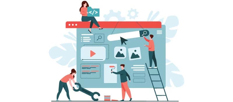
Analyzing a few statistics will help you understand the importance of having a good UI for your website.
- 38% of people do not purchase anything from websites that look unimpressive.
- Slow page loading causes the loss of around 47% of potential customers for a website.
- 94% of people do not trust websites for online purchases if the website interface is poor.
These studies indicate that user interface is essential for every website that intends to sell a product or service online. A good interface develops trust among the potential buyers, and it also improves the overall buying experience. Therefore, the retention rate of a business increases along with the conversion rate with a smart and trendy User Interface (UI) design.
Common Mistakes Made In User Interface Design
More than 88% of online buyers agree that they do not revisit a website after a poor experience. In most cases, poor interface leads to a poor experience. More surprisingly, only 55% of online businesses run user experience analysis. Therefore, many businesses lose potential buyers unknowingly.
You can prevent the loss of potential buyers with a few small UI amendments to your existing website. However, some websites may also need to undergo extensive revamping of the interface.
Here is an insight into some common mistakes made in the user interface design and how to prevent them.
1. The Website Is Not Responsive
There is a surge in online shopping observed globally. Most importantly, more than 3.8 million people across the globe use their handheld devices to access websites. Is your online business platform ready to welcome mobile device users? Does your website offer similar features to both desktop and handheld device users?
More than 80% of the customers use a smartphone today for online purchases. Thus, you need to make the website friendlier for mobile users. The best way of ensuring this is by embracing a responsive website design. Through responsive web design, you can improve the customers’ satisfaction in accessing through handheld devices.
A responsive website can change the interface determining the resolution and screen dimensions of the accessing device. As a result, both desktop and mobile phone users will find convenience in using such websites. A responsive web design interface improves the user experience and optimizes the page loading speed.
So, you should invest in responsive UI for your business website if you want to find a better conversion rate. A non-responsive website often has a low conversion rate, as it does not offer a satisfactory shopping experience to handheld device users.
Related: 20 Best And Free Responsive Drupal Themes
2. Unstructured Website Layout
Designers may love their creative mess, but customers like the interfaces that offer more breathing space. A simple and non-messy layout helps the customers to navigate the website easily and browse different products listed under various categories. Moreover, a cluttered interface creates confusion among the buyers. They cannot find the products and offers, and thus your business loses a few potential buyers.
So, how can you make the web interface clean and attractive? To draw the customers’ attention to different products and offers, you must focus on the following aspects:
- The landing page should have powerful headlines and captions with a smart image. Additionally, the landing page must also have CTA (Call to Action).
- A dedicated product page should not feature large images other than the product. At the bottom of the product page, you may also add photos and links to a few similar products.
- Prioritize your brand colors for website interface design. You can work with your business logo colors and other color combinations but ensure that it looks subtle and the colors are not overdone.
- Keeping a good proportion of the white space on the website interface is essential. The white space brings visual stability for web visitors.
Related: You Can Build A Website Without Knowing How To Code
3. Poor Website Navigation
Website navigation must be efficient to increase the conversion rate. A website with seamless navigation helps online businesses to build brand value and trust. Web visitors commonly expect a few things when they visit a website. For example, they expect a mission and vision statement under the About Us section.
If you sell multiple products, there should be properly defined categories, and the products should be listed under the right categories. If categories are messy, web visitors may leave the website and purchase the product from a competitor.
Related: Website Navigation Improvement: What Should You Do?
4. Absence Of CTAs
If you want to improve the conversion rate by revamping the website interface, you must focus on the CTAs. A website may have multiple call-to-action buttons strategically placed at different places. These CTAs aim to encourage the buyers to complete a transaction. If the CTAs are visually attractive, they draw a better conversion rate.
It is important to work on improving the appearance of the CTA. Think about how you can make the CTAs creative and visually attractive? Changing the CTA buttons’ text and background colors might help in improving their visibility.
5. Boring Long Text Content

A business website needs to describe the products and services through texts. Most businesses focus on developing top-quality content. But, having huge chunks of content on the website will not bring a satisfactory conversion rate. Along with the product description, you need to improve the visual appeal of the products. The visual appeals can improve through high-quality images.
Related: A Complete Guide To Creating Website Content That Wins Customers
6. No User Generated Content
A website has to build trust by featuring authentic information. Instead of believing in your product descriptions, potential buyers will like to believe in the product reviews from genuine customers. If you want to improve the conversion rate of your product, you need to give space to the user-generated content.
Moreover, the businesses must encourage the buyers to share their reviews on the product pages. Along with the texts, the buyers should obtain the facility to share product images and videos. Such reviews are more interactive, and they can dramatically improve the product’s conversion rate.
Related: 6 Benefits Of Online Reviews For Your Business
7. Large Images & Slow Loading Speed
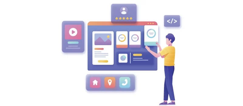
The slow loading speed of a website is troublesome, as it reduces visitors’ satisfaction. This is a big reason why visitors do not convert into buyers. Improving the web loading speed will improve the visitors’ experience, and they will love to purchase products from such websites.
According to industrial studies, more than 47% of web visitors expect a webpage to load in lesser than two seconds. If the page takes more than two seconds to load, it makes the website visitors impatient and they might wait for a few more seconds and if the web page doesn’t load till then, they eventually leave.
To get rid of the slow loading speed, the website interface should be optimized. Omitting large images and replacing them with smaller ones is a good way to improve website loading speed. Minimal design elements and flat images on the website improve the loading speed. Also, you need to ensure that your website is hosted on a robust web hosting platform that provides all the necessary resources for your website to function seamlessly during peak traffic times as well.
8. Disorganized Placement Of Icons

It is perfectly fine to have various icons on the website to help users in finding the right services without getting into confusion. For example, a visitor wants to share the product page link on his social media profile. Your website will have social media buttons with the icons of the specific social media platforms.
Iconography is crucial to improving the experience of website visitors. Moreover, icon design has an impact on the overall interface of the website. Modern web designers use flat images to optimize page loading speed for designing web icons. However, when you place the icons on the website make sure that they do not look disoriented; they should be perfectly synchronized and arranged in a way that simplifies website navigation for the visitors.
9. Inconsistent Design

Inconsistency in design makes the user interface poor. A website interface auditing is essential to find the inconsistency in website design. After identifying inconsistencies in website design, you need to get rid of them by revamping the web interface. Inconsistency happens due to many reasons.
Sometimes, a webpage does not show the content in the right order. In a few cases, a product page does not look similar to other website product pages. Such inconsistency causes a poor impression among the potential buyers. Ensure that that you are following a common theme and structure of pages and placement of content throughout the website.
Related: How To Improve My Design? 8 Design Tips For 2022
10. Guiding The Audience
Sometimes, your website interface can put buyers in a confusing state. For example, you may suggest a few similar products when buyers add a product to the cart. Such actions create confusion among the buyers, and they will not eventually buy anything. Moreover, the payment gateway and shopping cart interface should be simple to use and navigate. Ensure that the internal linking structure of the website is perfect and the users are always directed to the related pages that they would want to see. Make sure that relevant content is placed at the right places that will guide the audience perfectly.
Conclusion
Keeping these crucial factors in mind for improvising the website interface will result in a better conversion rate for your business. A good conversion rate means better profitability for online businesses. Minimal changes to the user interface can bring an excellent result.
You need to focus on making your website a complete package! Everything about your website must be perfect whether it is the website content, website design, the color scheme, the theme, or the user interface. This might not happen right away, there will be trial and error but consistency is the key.


