Website forms are one of the crucial strategies for generating leads and increasing conversions.
In fact, as per stats:
● 50% of marketers cite onsite forms as their main source of leads.
● 74% of companies implement website forms to generate leads.
● And 49.7% of companies say their online forms help them convert their highest lead.
Whether you are trying to gather lead info, offer subscriptions, or let people register for an event, your online forms will play a critical role.
It can be the deciding factor between generating a new sales lead and a bounce. To ensure that your lead generation form is optimized for your users, you should focus on form design.
In this article, we will be diving into 13 WordPress form design best practices and examples. But before that,
How can you create a form in WordPress?
There is no built-in form page in WordPress. But the CMS does offer many free and paid form plugins to help you create compelling and attractive forms. Most of the plugins are easy to use and beginner-friendly.
WPForms, Formidable Pro, Ninja Forms, Gravity Forms, and weForms are all WordPress form builder plugins designed to help you generate leads faster.
You can even hire a dedicated WordPress developer who has complete technical know-how about WordPress.
13 WordPress form design best practices and examples
Here are WordPress form design best practices and examples that you can emulate:
1. Use one column design
While filling up a form, users want to go through the process as quickly as possible. Thus, speed is a crucial element that you should keep in mind while designing the dorm.
One way to achieve this is to design forms with one column as they are faster to complete. This format allows users to naturally move their eyes down from top to bottom in a comfortable way.
However, if you design multiple columns, they will have to force their eyes to move back and forth, which is a slower process.
Plus, with multiple columns, users will have to utilize more cognitive effort to determine where they should begin and the sequence in which the fields should be filled.
If you look at the contact form designed by Sleeknote, it has only one column. Not only does it look neat and organized, but filling out the form will be quick and effortless.
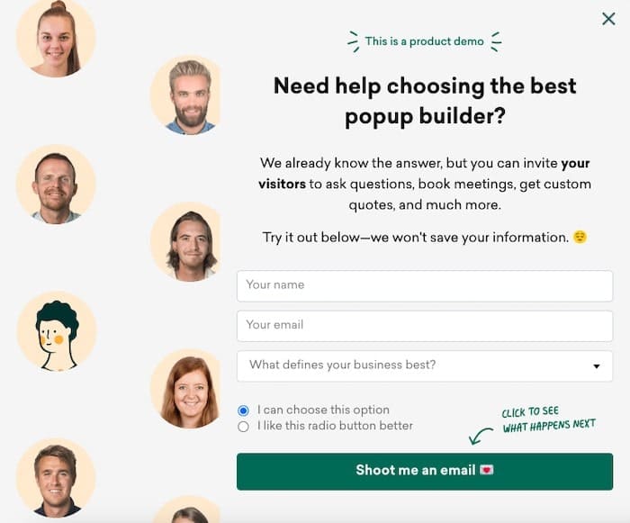
Now, let’s look at the form with two columns.
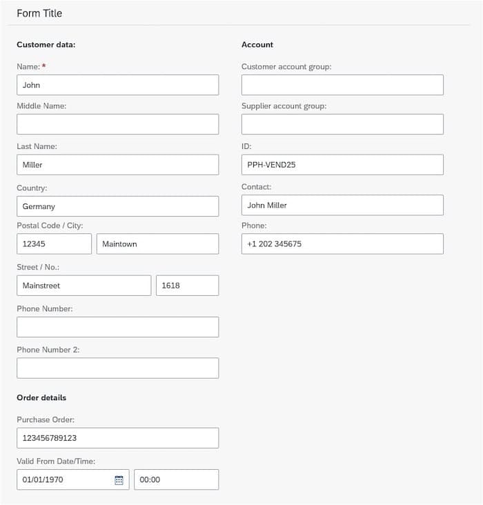
It looks messier and will require more thinking while filling out. Thus, users are likely to take more time. And more often than not, users might abandon your page without even filling the form.
Two-column forms can be confusing – users may even fail to see the other column, which may create accessibility problems.
2. Greet your visitors
To make a great first impression and create a friendly atmosphere, welcome your visitors prior to presenting them with queries and speak about the purpose of the form clearly.
Here is an excellent example of ALUXION’s contact form:
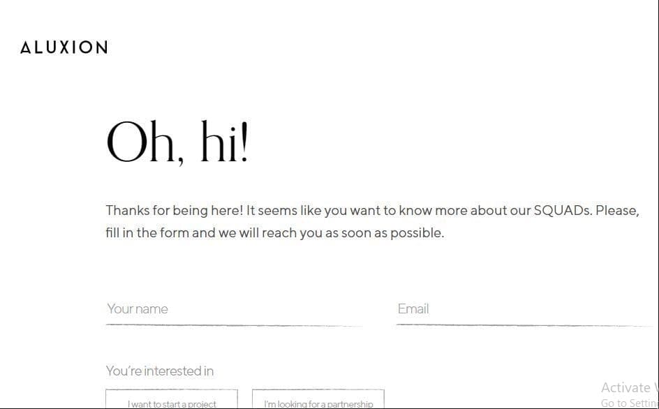
They greet their visitors first and thank them. The brand shows that they acknowledge their user’s presence and time. It is a professional approach, and the brand is making a great first impression.
3. Apply KISS (Keep It Simple, Stupid) rule
The “keep it simple, stupid” (KISS) rule is applicable to various aspects of sales and marketing, including web form design.
Ask only for info that you really need and leave the rest. If you take a look at this example from Zeroqode, the brand gets right to the point in their contact page form. This makes it decidedly easy for visitors to fill out the form.
You don’t find limitations or a lengthy list of fields that slows down the process.
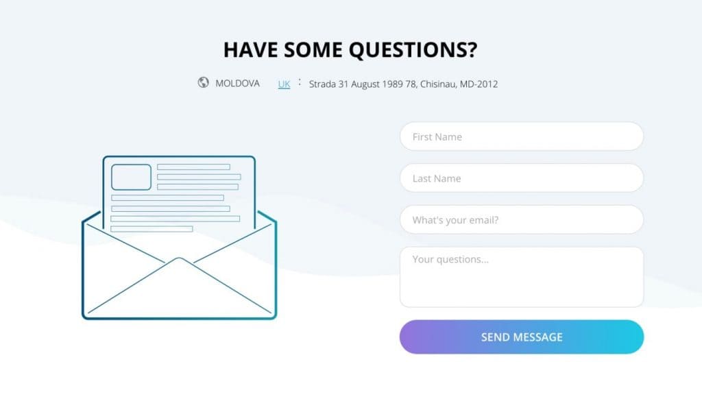
Their strategy is excellent for removing friction for the users. Since there is less chance of visitors feeling overwhelmed, it increases the chances of users completing the form completion process, and it may result in higher conversions.
If you look at the statistics, the average web form length was 5 form fields in 2019, and it primarily resulted in the highest conversion rates.
4. Use multi-step for long forms
When you have a lengthy form, you can break it into multiple pieces. It makes the process of filling out the forms less overwhelming, thus creating a positive user experience that in turn boosts conversions.
Have a look at the BrokerNotes form. BrokerNotes is an online platform that was established to aid investors in picking the best brokerage firm, depending on what they are investing in and their experience level.

In their multi-step form, they ask visitors relevant questions and filter the recommendations list to get suitable answers.
To offer this service, the brand has to work directly with brokers, service providers, and so on, who will want to contact them.
BrokerNotes has a contact page for this.
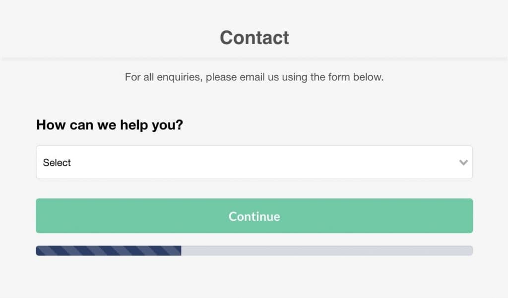
They have designed a multi-step form again on the contact page. They don’t ask for personal info from their users initially. Instead, they put their attention on them by inquiring what the brand can do to assist.
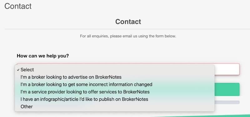
They also offer predetermined options from which users can choose. It lets the brand control the type of contact messages it gets. They list all the things that will be of value to users among the options while still allowing them to choose “other,” which can be marked as unimportant.
A report suggests that BrokerNotes was able to boost its homepage conversions from 11% to 46% by implementing multi-step forms.
5. Add auto-format
Adding auto-format to your forms is a great strategy. In this way, your user will always have the info stored in their browser. The form will be automatically filled with the stored information.
This strategy can even be applied to checkout forms. Many consumers are willing to save their credit card info with Google as it is a burden to look at the card every time and fill in the info every time they want to purchase a product or service.
6. Allow copy and paste
A great way to increase your conversion rate is to allow copying and pasting info in your forms. Your visitors may want to copy and paste the info to avoid misspelling and other problems. Plus, the fact that it is time-saving is also a bonus.
And when you don’t allow them that ease, they might abandon the form.
7. Explain why you are asking for specific data
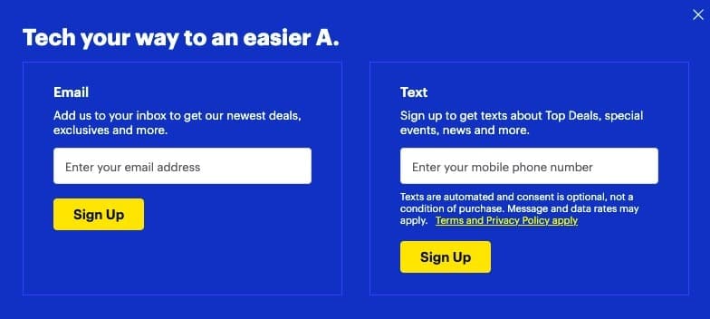
If you are asking for specific information from your users, don’t forget to explain the purpose of the inquiry. It will increase the trust and credibility of your customers. They might refuse to share confidential info if you don’t explain the purpose.
Here is how Bestbuy explains why the brand requires their users’ email:
8. Have a section next to your form to specify the benefits
Besides making the benefits of your offer crystal clear on your landing page, you can have a section on the page where you explain the offer more clearly.
Here’s an example of how to do this from Asana. They ask the visitors in their form to sign up for a free trial. But for conversion purposes, if you look on the right of the page, they are explaining the offer using brief bullet points.
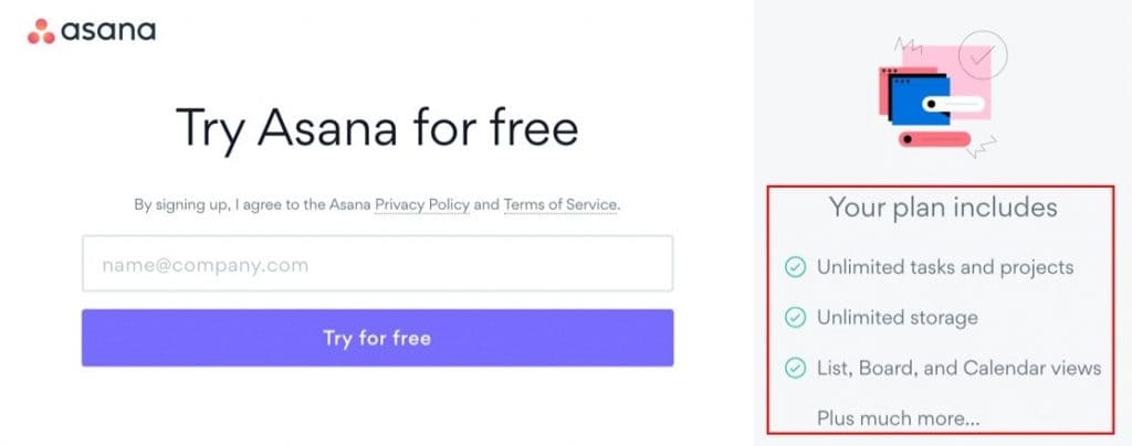
Also, note that they have used the word ‘unlimited’ more than once. When the user is excited about the offer, they will be more ready to fill out the form and press the submit button.
You might be giving out an incredible offer, but if it will be of no use if customers aren’t even aware of that in the first place. Thus, it is crucial to remind them about the benefits of filling out your form.
9. Use a clear call to action message
The CTA can be the determining factor between conversion and abandonment. So be sure to include an enticing CTA in your form.
Design a CTA button in the form and replace the bland “Sign Up Now” with something more creative and specific.
Here’s an example of a good CTA. The CTA phrase “Get My Free Week” is specific, and it makes it totally clear for the visitors as to what will happen when they click the CTA button.

It leaves no room for misunderstandings.
Remember to place the CTA button in an easy-to-spot location. It should also be attractive and able to grab the user’s attention.
When it comes to CTA button color, no single color is better than other colors. Just ensure that, but your CTA color contrasts with everything else on the particular page. It is to attract the attention of the visitors and not to miss it.
10. Instill FOMO in the minds of users
Don’t you focus on completing the most urgent and pressing tasks when you are busy? People have the tendency to grab an opportunity before they miss it. The same technique can be applied to marketing and sales as well.
FOMO can encourage your visitors to act immediately instead of leaving your website. For instance, you can provide your visitors with an exclusive offer. Customers want to be the first to know about new deals, offers, or discounts.
The landing page form below entices the users by letting them know that they will always get updates first before others if they sign up.
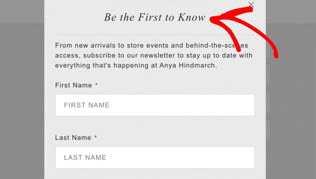
You can also consider offering a time-limited discount. Probably, your visitor will pounce upon the offer and act immediately.
11. Focus on mobile-friendliness
Mobile devices were credited for 54.8% of international website traffic in the first quarter of 2021.
It is thus clear why you should build a website form with mobile users in mind. A user-friendly design will help you to garner trust from a vast audience.
Regardless of what devices your visitors use, it is crucial to offer all users a good experience. Also, to make your form user-friendly, allow your users to switch to the next form field. It is annoying and time-consuming to constantly click on the necessary line.
12. Include your privacy policy to build trust
66% of customers say transparency is among the most attractive qualities in a brand. Including your privacy policy can build transparency and thus gain the trust of your customers.
Get creative, though, while adding it to your forms. Instead of saying “we never spam you,” come up with a phrase relevant to your offer.
Here’s an example of how Shopify does it. Their privacy statement about their email campaign is straightforward and trustworthy and most likely to improve the conversion rate.
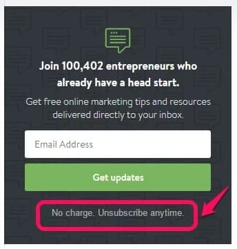
You may have all the good intentions, but unless your prospects trust you, they won’t be ready to give out their info.
Below is another example by Neil Patel. His privacy statement on his personal blog lead generation form looks like this:
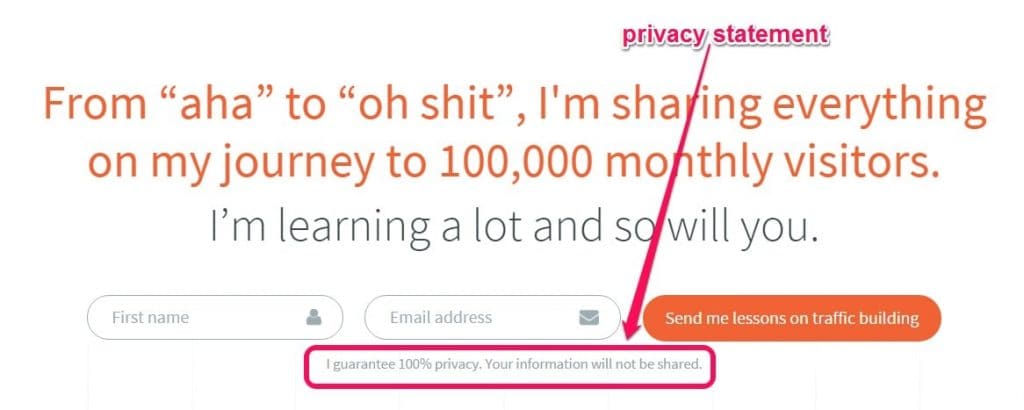
You need to add privacy policies for legal reasons. But it will also allow your brand to be transparent and help build trust with your users. Assure your visitors that their information is safe with you, especially their payment info.
13. Implement analytics
Data is crucial for lead generation, forms, and anything else on your website. Tools such as Google Analytics are designed for this.
For WordPress users, there are easy-to-use tools such as MonsterInsights. This plugin can streamline critical data for you and present it in your WordPress dashboard.
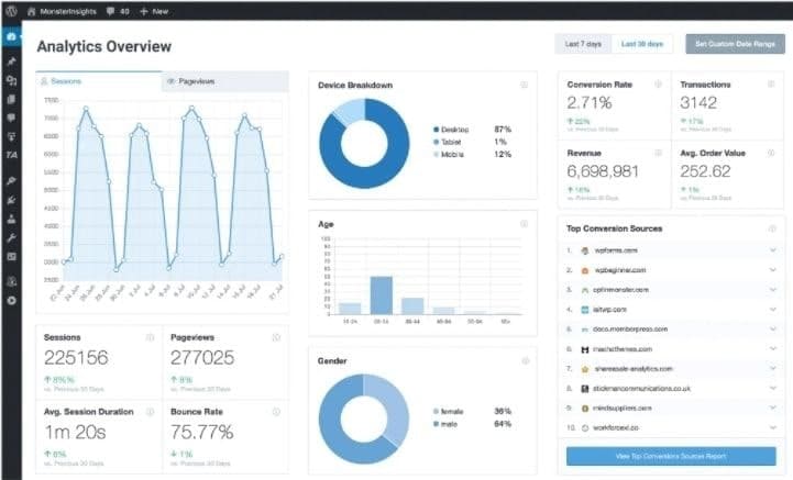
You can use the data to make improvements.
Related Article: 5 Apt Website Designing and Development Tools in 2021
Wrap-up
There you have it! 13 WordPress form design best practices and examples that will help you to garner leads and convert them.
Use one-column design, greet your visitors to make an excellent first impression, apply the KISS principle, and use multi-step forms if your form is too long.
Additionally, make sure to leverage FOMO, add a clear and attractive CTA button, and follow the other tips, such as adding auto-format, allowing copy and paste, improving mobile-friendliness, adding a privacy policy.
At the same time, don’t forget to monitor your form using analytics to improve user experience and build trust with your visitors. 63% of marketers cite that their biggest marketing challenge is generating traffic and leads. Gain a competitive advantage by following the strategies listed in this article.


